Difference between revisions of "Main Page"
| Line 129: | Line 129: | ||
To find out more about how this Association functions please see its [https://www.apertus.org/mission-statement Mission Statement]. | To find out more about how this Association functions please see its [https://www.apertus.org/mission-statement Mission Statement]. | ||
If you can't find what you're looking for or if we can help you with custom requirements please [https://www.apertus.org/contact contact] us. | |||
====Projects==== | ====Projects==== | ||
| Line 140: | Line 142: | ||
|} | |} | ||
Revision as of 21:05, 17 May 2019
<css> .apertus-header {
   width: 100%;
   margin: 1em 0 1em 0;
   background: #ebebeb;
   /* border: 1px solid #ddd; */
   justify-content: center;
   display: flex;
}
.useful-links {
   margin: 0 auto;
   background: #ebebeb;
   font-size: 1.3em;
   font-weight: bold;
   text-align: center;
   padding: 0.5em;
   width: 100%;
}
.camera-overview {
   display: flex;
   width: 100%;
   margin-top: 1em;
   margin-bottom: 1em;
   background: #f8f8f8;
   /* flex-wrap: wrap; */
   flex-direction: row;
   font-size: 1.2em;
}
.camera-column {
   display: flex;
   flex-direction: column;
   flex-grow: 1;
   flex-basis: 0;
   border: 1px solid #ddd;
   /* height: 70vh; */
}
.column-header {
   margin: 0;
   background: #ebebeb;
   font-size: 1.4em;
   height: 2.5em;
   font-weight: bold;
   line-height: 2.5em;
   outline: 1px solid #ddd;
   text-align: center;
   color: #474747;
   /* padding: 0.2em 0.4em; */
   /* flex: 0 0 calc(100% / 3); */
}
.links-column-header {
   margin: 0;
   background: #ebebeb;
   font-size: 1.2em;
   height: 2em;
   font-weight: bold;
   line-height: 2em;
   outline: 1px solid #ddd;
   color: #474747;
   box-sizing: border-box;
   padding-left: 0.5em;
   margin-bottom: 1em;
}
.camera-image-container {
   /*flex: 0 0 calc(100% / 3);*/
   /* width: 33%; */
   border-bottom: 1px solid #ddd;
   box-sizing: border-box;
   width: 100%;
   padding: 0.5em;
   height: 12em;
   display: flex;
   align-items: center;
   justify-content: center;
}
.camera-links {
   box-sizing: border-box;
   padding: 1em;
}
.camera-image-container img {
   max-height: 11em;
   width: auto;
}
.link-overview {
   display: flex;
   flex-direction: row;
   width: 100%;
   font-size: 1.1em;
}
.flex-column {
   border: 1px solid #ddd;
   box-sizing: border-box;
   display: flex;
   flex-direction: column;
   background: #f8f8f8;
}
.left-column {
   flex-basis: 55%;
   margin-right: 0.5em;
}
.right-column {
   flex-basis: 45%;
   margin-left: 0.5em;
}
.link-column {
   box-sizing: border-box;
   padding: 0.5em;
} </css>
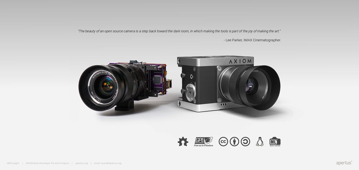
For over ten years our worldwide community has been developing a variety of powerful and affordable tools designed to give users absolute and unparalleled control over their creative processes. All projects are made free (in terms of liberty) around open source software and open hardware licenses with any and all related knowledge being made publicly available.
To find out more about how this Association functions please see its Mission Statement.
If you can't find what you're looking for or if we can help you with custom requirements please contact us.
1 Projects
| AXIOM Beta |
| AXIOM Remote |
| OpenCine |

